Second Chair
Timeline
January 2023 - May 2023
My Role
UX Researcher & Designer
Overview
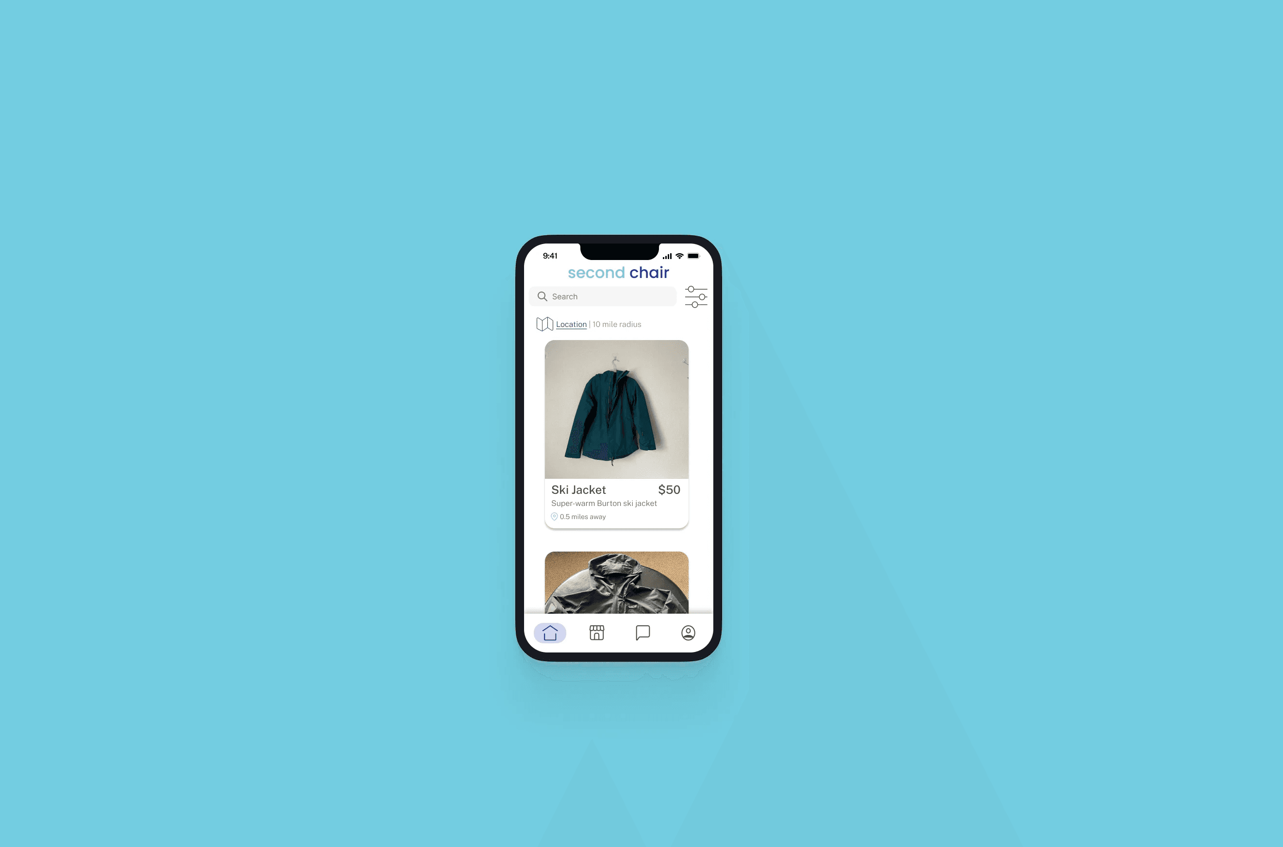
Getting outside is expensive - and while purchasing gear used is an option, the process can be cumbersome. There are several options to purchase used from, such as apps like Facebook Marketplace or specialty stores, and lots of time is required searching these platforms/stores to find the exact item desired. Second Chair is a one-stop-shop: an online marketplace to purchase and sell outdoor gear.
Problem
Outdoor hobbies are expensive due to high cost of gear - according to the Outdoor Foundation's 2018 Outdoor Recreation Participation Report, high cost of gear is the #2 deterrent to getting outside. Purchasing gear secondhand is a cost-saving alternative, but in my experience and speaking with friends, finding the desired piece of gear used can be a time-consuming, resource-intensive process.
I set out to answer the question: How can we alleviate the frustration associated with purchasing secondhand gear?
Approach
Research
I began my design process with discovery research, and conducted interviews with 10 potential users. My research goals were to uncover more context around the following:
Purchases and disposal of outdoor gear - when, how, and why
Experiences with secondhand gear - have they bought or sold it, and what have the experiences been like
Experiences with platforms to purchase second-hand items
I developed an affinity map to synthesize my interview data, find common patterns, and determine user needs and pain points.
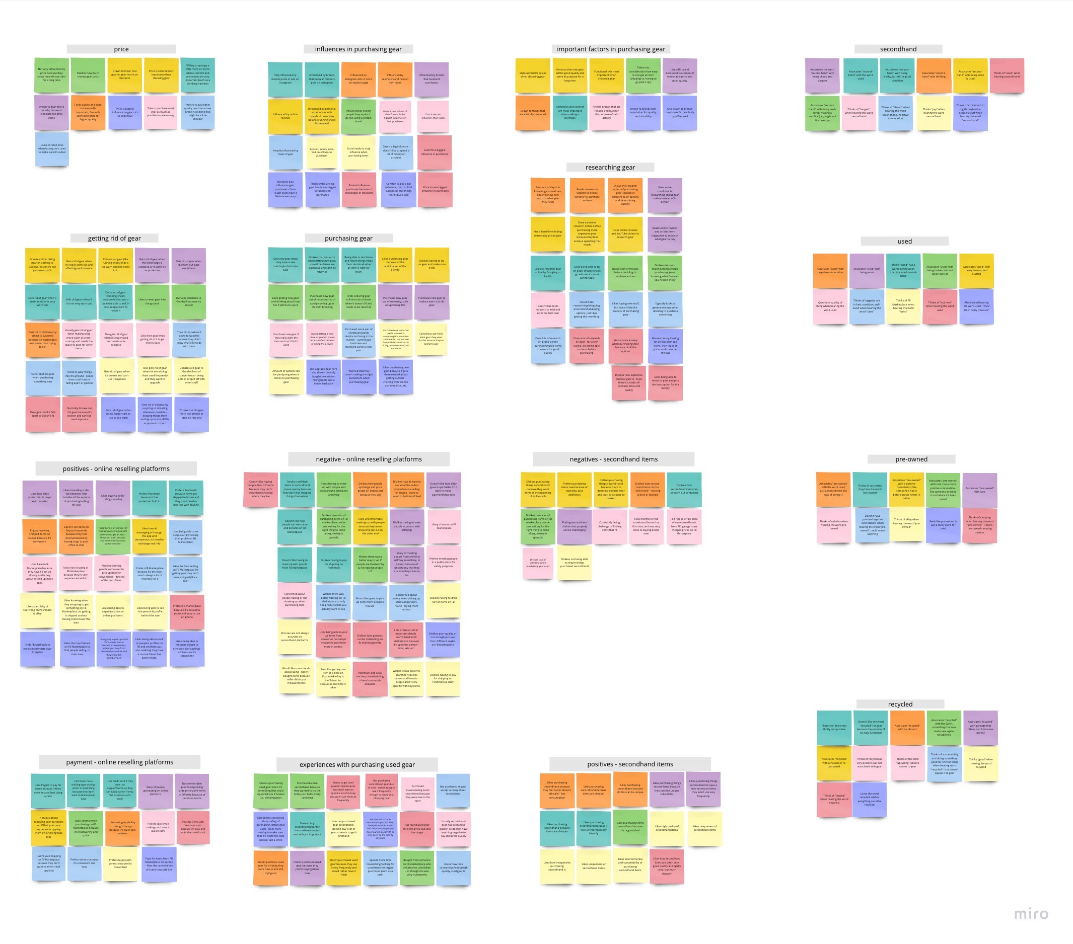
I uncovered the following insights:
People purchase used gear to save money. They enjoy purchasing used because it allows them to get high-end, quality gear at a price point they can afford.
People get rid of gear when they are going through big life changes - things like moving or losing weight. Another factor was changes in interest. They may find an item they prefer aesthetically, or just not enjoy an activity anymore.
Making used gear accessible is a two sided-problem.
Depending on how big of a purchase it is, it can take weeks of searching different platforms, messaging sellers, and maybe even hunting at different in-person shops all just to find a piece of gear in your budget, desired size, and make.
On the other hand, when it comes to getting rid of gear, people find themselves not knowing what to do. Outdoorsy people care about the environment, and don't want to throw old gear away and contribute waste if they can avoid it. Generally they do what’s most convenient - taking it to Goodwill or eventually giving in and throwing it away.
I created 4 core user types, varying on the desire to save money and the frequency of life or interest changes. For the MVP, I targeted The Social Thrifters as the buyers and The Influenced as the sellers, as they are the 2 types most frequently buying/selling used gear and I believe will be the earliest adopters. The other 2 user types will be addressed in later iterations of the product.
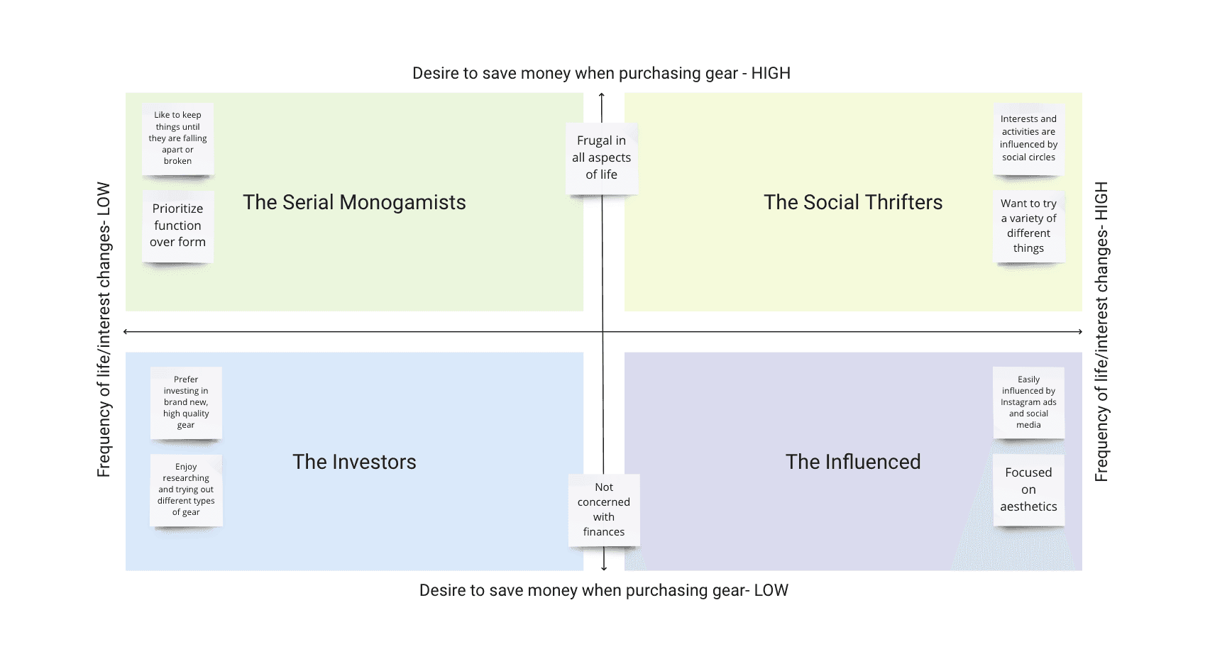
The Social Thrifters tend to be very frugal in all aspects of their life, and value saving money. They partake in and want to try a variety of different activities, and enjoy purchasing used gear because it is a cheaper way for them to try new things. However, they find themselves frustrated with the amount of time they spend searching for used gear. Their goal is to purchase high quality secondhand gear at a low cost.
The Influenced tend to be more frivolous with their purchases, are focused on aesthetics and how an item looks. Additionally, they are very influenced by social media and items they see on Instagram and TikTok. They will purchase new gear when they see something they like better. As a result, they would like to get rid of their old gear (which is still in good condition), but frequently hold on to it since they are not sure how to sustainably do so. Their goal is an easy method to dispose of their unwanted gear.
To better visualize the experience of these 2 types, I created user journeys.
On one hand you have Social Thrifters (green) who are struggling to purchase gear, and on the other hand, the Influenced (purple) struggling to dispose of it - there's a need for the two to connect.
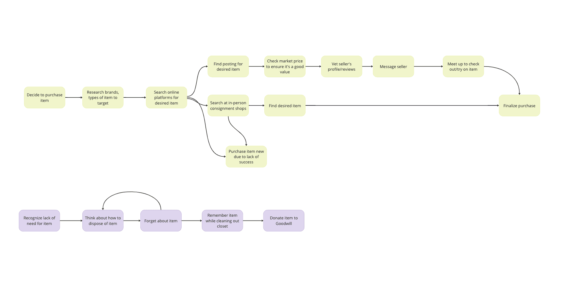
Here is the user journey with Second Chair (in blue), which allows the two types to interact seamlessly.

Design
Based on my interview data, I honed my product down to its core features:
Able to browse different types of gear, search, and filter by activity - competitors lack useful filtering for gear-specific fields, which means it takes a lot of time to find the desired item
Gear-specific fields in listings means there’s more consistency - with other online platforms, sellers often get lazy and will enter the bare minimum, making it even harder to find the desired object.
Buyers and sellers are able to chat - since the product is all about connecting buyers and sellers, they need to be able to communicate to ask questions, negotiate pricing, and coordinate the meetup.
Safety is very important - nearly every interviewee mentioned they are very wary of scams online. In the MVP, users will be required to upload a picture to verify themselves, and this will be further addressed in a later iteration of the product with a seller review system.
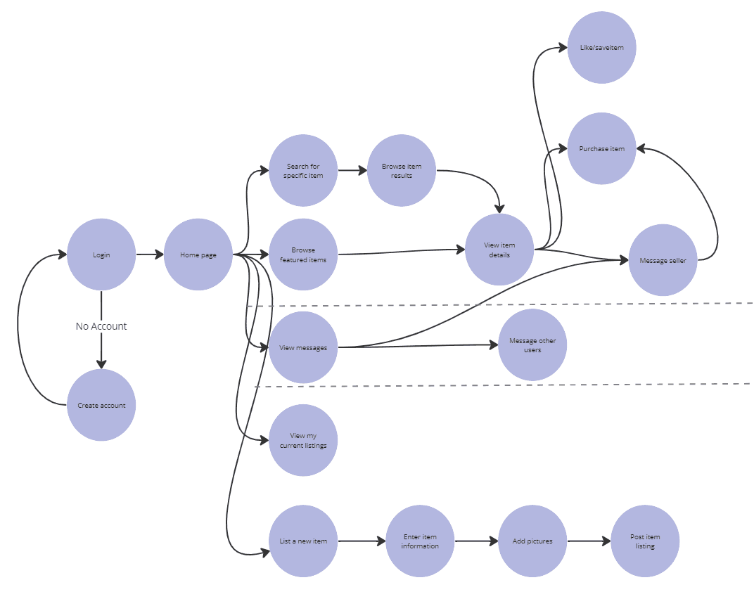
I began my design process by creating a user flow for the app. The circles above the top dotted line are buyer actions, the circles below the bottom dotted line are seller actions, and the circles between the dotted lines are actions both user types may take.
I then moved into low fidelity wireframes, guided by the flow above.
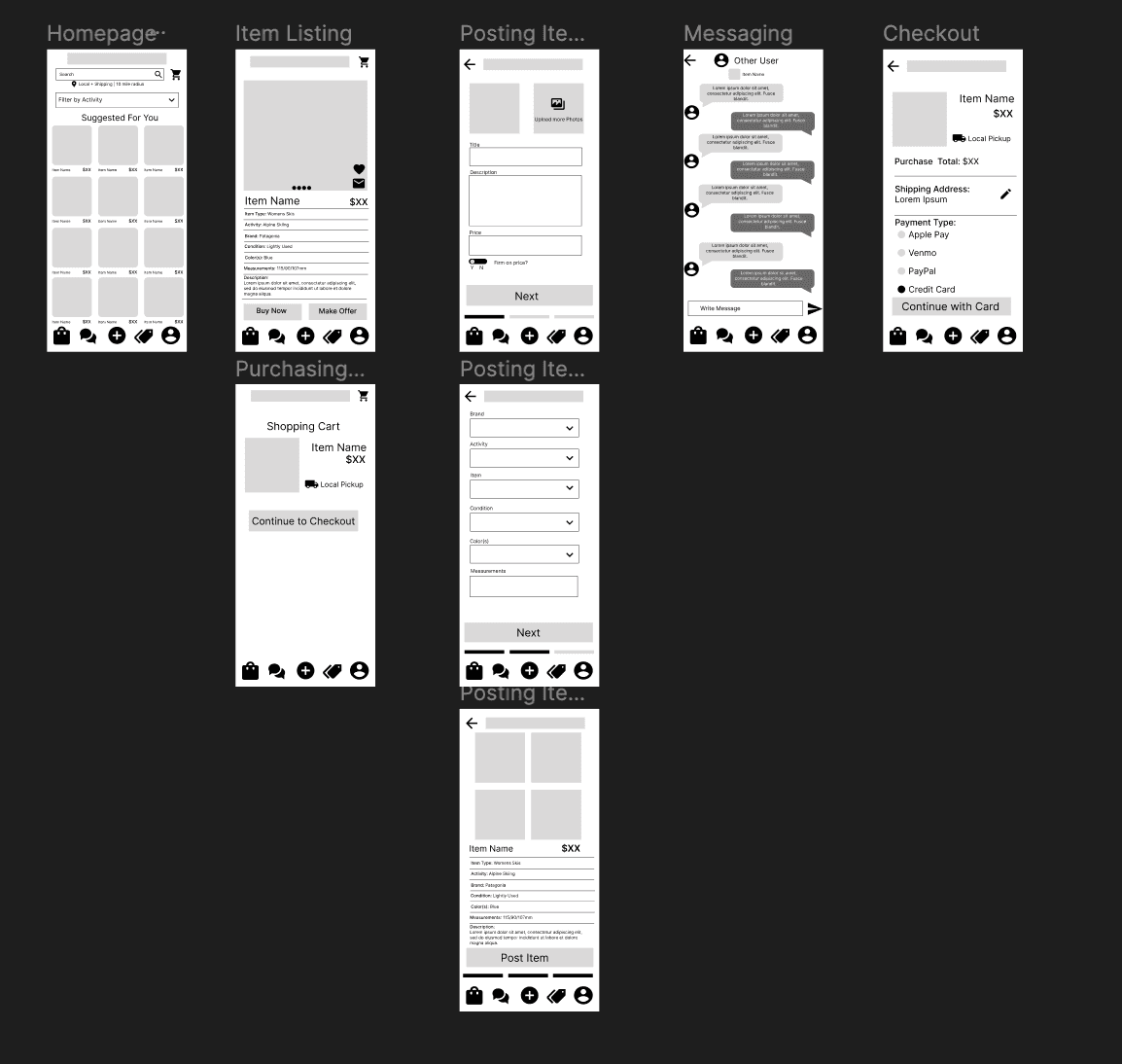
Moving into the first draft of high fidelity mockups, I made several changes based on a combination of more thought on my end and feedback from mentors/instructors:
Navigation
In the low fidelity wireframes, the icons in the bottom navigation bar were intended to signify Browse Postings, Messages Center, Post a Listing, My Listings, and Profile.
Pared down the navigation bar to 4 icons to better includes both user types, as buyers would have no use for posting listing or viewing current listings.
Removed the option of a shopping cart for the sake of technical complexity, so the checkout flow has a single point of entry. Removing a shopping cart eliminates need to track what state in the checkout process an item may be in, since stock is limited to one item.
Home Page
Reduced the amount of items shown on the homepage to reduce visual clutter.
Removed the "Filter by Activity" dropdown and replacing it with a more prominent filter icon that causes a bottom sheet to pop up. Filtering wasn't prominent on my initial wireframes.
Removed the "Suggested for You", as making personalized recommendations is too technically complex to implement in an MVP. Instead, a random assortment of featured items within the user's desired radius will be shown on the home page.
Purchases and Listings page
This page was originally only going to be for viewing listings, but I added past purchases to accommodate buyers in addition to sellers.
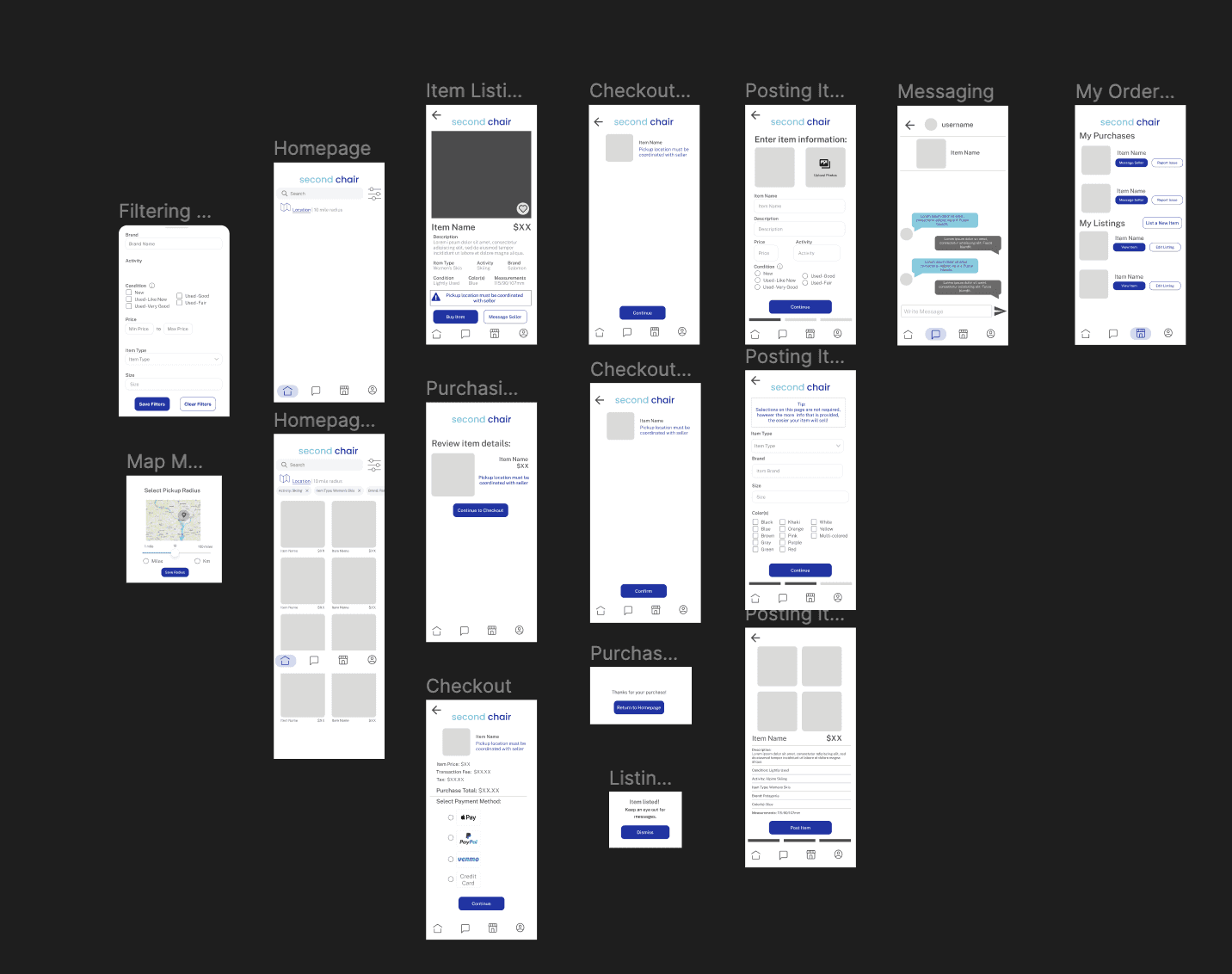
Between my initial high fidelity mockups and my final prototype, I iterated once more:
Homepage
One column of items on the homepage to make it easier to digest, plus descriptions and distances added to item cards.
Checkout
Throughout the checkout flow, there are several reminders that buyers and sellers will need to coordinate the purchase themselves.
Reminders that payment will be held until item confirmation is received. Buyers/sellers will have 10 days to coordinate the exchange once a purchase happens.
I also added real photos and details to gear listings, which made a huge difference in the appearance of the product.

Outcome
Check out the final prototype here!
Overall, I enjoyed the process of creating Second Chair and learning about end-to-end product design. If time permitted, I would have liked to conduct a usability test with my prototype to see how real users respond to it.
Second Chair
Timeline
January 2023 - May 2023
My Role
UX Researcher & Designer

Overview
Getting outside is expensive - and while purchasing gear used is an option, the process can be cumbersome. There are several options to purchase used from, such as apps like Facebook Marketplace or specialty stores, and lots of time is required searching these platforms/stores to find the exact item desired. Second Chair is a one-stop-shop: an online marketplace to purchase and sell outdoor gear.
Problem
Outdoor hobbies are expensive due to high cost of gear - according to the Outdoor Foundation's 2018 Outdoor Recreation Participation Report, high cost of gear is the #2 deterrent to getting outside. Purchasing gear secondhand is a cost-saving alternative, but in my experience and speaking with friends, finding the desired piece of gear used can be a time-consuming, resource-intensive process.
I set out to answer the question: How can we alleviate the frustration associated with purchasing secondhand gear?
Approach
Research
I began my design process with discovery research, and conducted interviews with 10 potential users. My research goals were to uncover more context around the following:
Purchases and disposal of outdoor gear - when, how, and why
Experiences with secondhand gear - have they bought or sold it, and what have the experiences been like
Experiences with platforms to purchase second-hand items
I developed an affinity map to synthesize my interview data, find common patterns, and determine user needs and pain points.

I uncovered the following insights:
People purchase used gear to save money. They enjoy purchasing used because it allows them to get high-end, quality gear at a price point they can afford.
People get rid of gear when they are going through big life changes - things like moving or losing weight. Another factor was changes in interest. They may find an item they prefer aesthetically, or just not enjoy an activity anymore.
Making used gear accessible is a two sided-problem.
Depending on how big of a purchase it is, it can take weeks of searching different platforms, messaging sellers, and maybe even hunting at different in-person shops all just to find a piece of gear in your budget, desired size, and make.
On the other hand, when it comes to getting rid of gear, people find themselves not knowing what to do. Outdoorsy people care about the environment, and don't want to throw old gear away and contribute waste if they can avoid it. Generally they do what’s most convenient - taking it to Goodwill or eventually giving in and throwing it away.
I created 4 core user types, varying on the desire to save money and the frequency of life or interest changes. For the MVP, I targeted The Social Thrifters as the buyers and The Influenced as the sellers, as they are the 2 types most frequently buying/selling used gear and I believe will be the earliest adopters. The other 2 user types will be addressed in later iterations of the product.

The Social Thrifters tend to be very frugal in all aspects of their life, and value saving money. They partake in and want to try a variety of different activities, and enjoy purchasing used gear because it is a cheaper way for them to try new things. However, they find themselves frustrated with the amount of time they spend searching for used gear. Their goal is to purchase high quality secondhand gear at a low cost.
The Influenced tend to be more frivolous with their purchases, are focused on aesthetics and how an item looks. Additionally, they are very influenced by social media and items they see on Instagram and TikTok. They will purchase new gear when they see something they like better. As a result, they would like to get rid of their old gear (which is still in good condition), but frequently hold on to it since they are not sure how to sustainably do so. Their goal is an easy method to dispose of their unwanted gear.
To better visualize the experience of these 2 types, I created user journeys.
On one hand you have Social Thrifters (green) who are struggling to purchase gear, and on the other hand, the Influenced (purple) struggling to dispose of it - there's a need for the two to connect.

Here is the user journey with Second Chair (in blue), which allows the two types to interact seamlessly.

Design
Based on my interview data, I honed my product down to its core features:
Able to browse different types of gear, search, and filter by activity - competitors lack useful filtering for gear-specific fields, which means it takes a lot of time to find the desired item
Gear-specific fields in listings means there’s more consistency - with other online platforms, sellers often get lazy and will enter the bare minimum, making it even harder to find the desired object.
Buyers and sellers are able to chat - since the product is all about connecting buyers and sellers, they need to be able to communicate to ask questions, negotiate pricing, and coordinate the meetup.
Safety is very important - nearly every interviewee mentioned they are very wary of scams online. In the MVP, users will be required to upload a picture to verify themselves, and this will be further addressed in a later iteration of the product with a seller review system.
I began my design process by creating a user flow for the app. The circles above the top dotted line are buyer actions, the circles below the bottom dotted line are seller actions, and the circles between the dotted lines are actions both user types may take.

I then moved into low fidelity wireframes, guided by the flow above.

Moving into the first draft of high fidelity mockups, I made several changes based on a combination of more thought on my end and feedback from mentors/instructors:
Navigation
In the low fidelity wireframes, the icons in the bottom navigation bar were intended to signify Browse Postings, Messages Center, Post a Listing, My Listings, and Profile.
Pared down the navigation bar to 4 icons to better includes both user types, as buyers would have no use for posting listing or viewing current listings.
Removed the option of a shopping cart for the sake of technical complexity, so the checkout flow has a single point of entry. Removing a shopping cart eliminates need to track what state in the checkout process an item may be in, since stock is limited to one item.
Home Page
Reduced the amount of items shown on the homepage to reduce visual clutter.
Removed the "Filter by Activity" dropdown and replacing it with a more prominent filter icon that causes a bottom sheet to pop up. Filtering wasn't prominent on my initial wireframes.
Removed the "Suggested for You", as making personalized recommendations is too technically complex to implement in an MVP. Instead, a random assortment of featured items within the user's desired radius will be shown on the home page.
Purchases and Listings page
This page was originally only going to be for viewing listings, but I added past purchases to accommodate buyers in addition to sellers.

Between my initial high fidelity mockups and my final prototype, I iterated once more:
Homepage
One column of items on the homepage to make it easier to digest, plus descriptions and distances added to item cards.
Checkout
Throughout the checkout flow, there are several reminders that buyers and sellers will need to coordinate the purchase themselves.
Reminders that payment will be held until item confirmation is received. Buyers/sellers will have 10 days to coordinate the exchange once a purchase happens.
I also added real photos and details to gear listings, which made a huge difference in the appearance of the product.

Outcome
Check out the final prototype here!
Overall, I enjoyed the process of creating Second Chair and learning about end-to-end product design. If time permitted, I would have liked to conduct a usability test with my prototype to see how real users respond to it.
Second Chair
Timeline
January 2023 - May 2023
My Role
UX Researcher & Designer

Overview
Getting outside is expensive - and while purchasing gear used is an option, the process can be cumbersome. There are several options to purchase used from, such as apps like Facebook Marketplace or specialty stores, and lots of time is required searching these platforms/stores to find the exact item desired. Second Chair is a one-stop-shop: an online marketplace to purchase and sell outdoor gear.
Problem
Outdoor hobbies are expensive due to high cost of gear - according to the Outdoor Foundation's 2018 Outdoor Recreation Participation Report, high cost of gear is the #2 deterrent to getting outside. Purchasing gear secondhand is a cost-saving alternative, but in my experience and speaking with friends, finding the desired piece of gear used can be a time-consuming, resource-intensive process.
I set out to answer the question: How can we alleviate the frustration associated with purchasing secondhand gear?
Approach
Research
I began my design process with discovery research, and conducted interviews with 10 potential users. My research goals were to uncover more context around the following:
Purchases and disposal of outdoor gear - when, how, and why
Experiences with secondhand gear - have they bought or sold it, and what have the experiences been like
Experiences with platforms to purchase second-hand items
I developed an affinity map to synthesize my interview data, find common patterns, and determine user needs and pain points.

I uncovered the following insights:
People purchase used gear to save money. They enjoy purchasing used because it allows them to get high-end, quality gear at a price point they can afford.
People get rid of gear when they are going through big life changes - things like moving or losing weight. Another factor was changes in interest. They may find an item they prefer aesthetically, or just not enjoy an activity anymore.
Making used gear accessible is a two sided-problem.
Depending on how big of a purchase it is, it can take weeks of searching different platforms, messaging sellers, and maybe even hunting at different in-person shops all just to find a piece of gear in your budget, desired size, and make.
On the other hand, when it comes to getting rid of gear, people find themselves not knowing what to do. Outdoorsy people care about the environment, and don't want to throw old gear away and contribute waste if they can avoid it. Generally they do what’s most convenient - taking it to Goodwill or eventually giving in and throwing it away.
I created 4 core user types, varying on the desire to save money and the frequency of life or interest changes. For the MVP, I targeted The Social Thrifters as the buyers and The Influenced as the sellers, as they are the 2 types most frequently buying/selling used gear and I believe will be the earliest adopters. The other 2 user types will be addressed in later iterations of the product.

The Social Thrifters tend to be very frugal in all aspects of their life, and value saving money. They partake in and want to try a variety of different activities, and enjoy purchasing used gear because it is a cheaper way for them to try new things. However, they find themselves frustrated with the amount of time they spend searching for used gear. Their goal is to purchase high quality secondhand gear at a low cost.
The Influenced tend to be more frivolous with their purchases, are focused on aesthetics and how an item looks. Additionally, they are very influenced by social media and items they see on Instagram and TikTok. They will purchase new gear when they see something they like better. As a result, they would like to get rid of their old gear (which is still in good condition), but frequently hold on to it since they are not sure how to sustainably do so. Their goal is an easy method to dispose of their unwanted gear.
To better visualize the experience of these 2 types, I created user journeys.
On one hand you have Social Thrifters (green) who are struggling to purchase gear, and on the other hand, the Influenced (purple) struggling to dispose of it - there's a need for the two to connect.

Here is the user journey with Second Chair (in blue), which allows the two types to interact seamlessly.

Design
Based on my interview data, I honed my product down to its core features:
Able to browse different types of gear, search, and filter by activity - competitors lack useful filtering for gear-specific fields, which means it takes a lot of time to find the desired item
Gear-specific fields in listings means there’s more consistency - with other online platforms, sellers often get lazy and will enter the bare minimum, making it even harder to find the desired object.
Buyers and sellers are able to chat - since the product is all about connecting buyers and sellers, they need to be able to communicate to ask questions, negotiate pricing, and coordinate the meetup.
Safety is very important - nearly every interviewee mentioned they are very wary of scams online. In the MVP, users will be required to upload a picture to verify themselves, and this will be further addressed in a later iteration of the product with a seller review system.
I began my design process by creating a user flow for the app. The circles above the top dotted line are buyer actions, the circles below the bottom dotted line are seller actions, and the circles between the dotted lines are actions both user types may take.

I then moved into low fidelity wireframes, guided by the flow above.

Moving into the first draft of high fidelity mockups, I made several changes based on a combination of more thought on my end and feedback from mentors/instructors:
Navigation
In the low fidelity wireframes, the icons in the bottom navigation bar were intended to signify Browse Postings, Messages Center, Post a Listing, My Listings, and Profile.
Pared down the navigation bar to 4 icons to better includes both user types, as buyers would have no use for posting listing or viewing current listings.
Removed the option of a shopping cart for the sake of technical complexity, so the checkout flow has a single point of entry. Removing a shopping cart eliminates need to track what state in the checkout process an item may be in, since stock is limited to one item.
Home Page
Reduced the amount of items shown on the homepage to reduce visual clutter.
Removed the "Filter by Activity" dropdown and replacing it with a more prominent filter icon that causes a bottom sheet to pop up. Filtering wasn't prominent on my initial wireframes.
Removed the "Suggested for You", as making personalized recommendations is too technically complex to implement in an MVP. Instead, a random assortment of featured items within the user's desired radius will be shown on the home page.
Purchases and Listings page
This page was originally only going to be for viewing listings, but I added past purchases to accommodate buyers in addition to sellers.

Between my initial high fidelity mockups and my final prototype, I iterated once more:
Homepage
One column of items on the homepage to make it easier to digest, plus descriptions and distances added to item cards.
Checkout
Throughout the checkout flow, there are several reminders that buyers and sellers will need to coordinate the purchase themselves.
Reminders that payment will be held until item confirmation is received. Buyers/sellers will have 10 days to coordinate the exchange once a purchase happens.
I also added real photos and details to gear listings, which made a huge difference in the appearance of the product.

Outcome
Check out the final prototype here!
Overall, I enjoyed the process of creating Second Chair and learning about end-to-end product design. If time permitted, I would have liked to conduct a usability test with my prototype to see how real users respond to it.